Masthead Component Design for Contentful

CLIENT - Pinterest
ROLE - Product Design, UI/UX, Art Direction
PROBLEM
ROLE - Product Design, UI/UX, Art Direction
PROBLEM
Pinterest’s current CMS components fall short of modern UX standards and partner needs. Content creators are constrained by rigid layouts that don’t adapt well across screen sizes and offer limited accessibility support. This has led to inconsistent branding, missed storytelling opportunities, and reduced engagement, particularly on mobile and partner-driven experiences.
SOLUTION
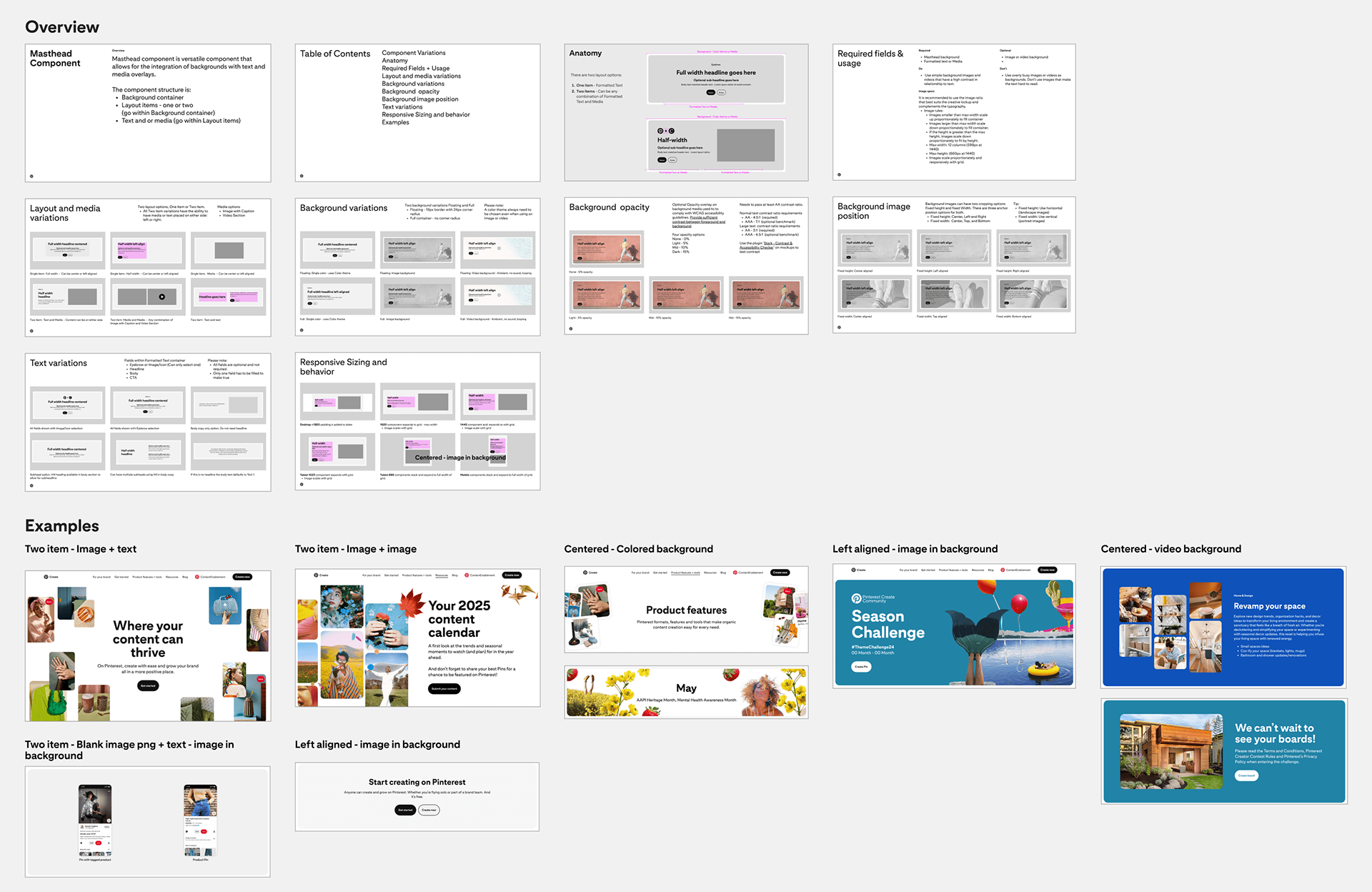
The new Masthead component is designed to address these challenges with a flexible, modular structure that supports a wide range of use cases. It allows content editors to configure backgrounds, layouts, and media/text overlays with ease, while ensuring consistent, accessible, and responsive design. Built specifically for Contentful, this component enables partners to deliver visually rich, on-brand experiences across devices and user contexts.
The new Masthead component is designed to address these challenges with a flexible, modular structure that supports a wide range of use cases. It allows content editors to configure backgrounds, layouts, and media/text overlays with ease, while ensuring consistent, accessible, and responsive design. Built specifically for Contentful, this component enables partners to deliver visually rich, on-brand experiences across devices and user contexts.
Comparative Analysis - Existing vs new component
Why a New Component Was Needed
Updating the existing Text With Media and Split Screen components wasn’t feasible due to their structural limitations and reliance on the Formatted Text component. Improving either would require widespread changes across multiple systems and risk breaking existing content.


Key Barriers to Updating Existing Components
• Text scaling issues on desktop and mobile
• Inconsistent padding per headline size; both rely on Formatted Text
• Limited layout options (no text on both sides, inflexible columns)
• Non-responsive images and no support for custom aspect ratios
• No background color options
• Rigid breakpoint behavior—side-by-side layout persists until 767px
• Split Screen doesn’t follow the grid, and adjusting spacing or image padding would affect all existing uses
• Text can break image layout if content is too long
Why Start Fresh - The new Masthead component solves these issues with:
• Unified, consistent spacing across headings
• Fully responsive layout and media
• Grid alignment and flexible breakpoints
• Support for background colors and customizable image ratios
• Cleaner, more maintainable code—without disrupting legacy content
• Fully responsive layout and media
• Grid alignment and flexible breakpoints
• Support for background colors and customizable image ratios
• Cleaner, more maintainable code—without disrupting legacy content
Use cases on Create site

Initial visualization
The Masthead component features a full-width background with one or two content columns, supporting text, media, and CTA buttons. It aligns to the grid, scales responsively, and improves text hierarchy for better readability across devices.


Updated type styles
Typography was optimized by reducing text size and tightening line spacing to enhance clarity and improve overall readability.
Typography was optimized by reducing text size and tightening line spacing to enhance clarity and improve overall readability.

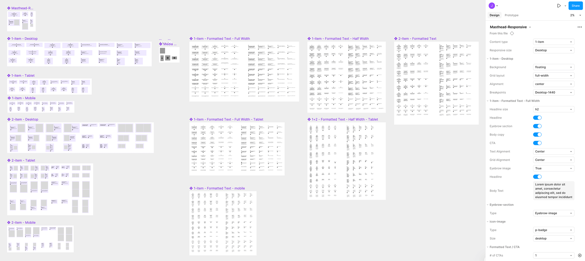
Full documentation

Responsive sizing


Background behavior

Engineering Collaboration & Testing Synopsis
I collaborated with engineers to resolve issues related to breakpoints, text scaling, and image sizing. Testing focused on ensuring responsive layouts, consistent typography, and properly scaled images across devices, resulting in a more reliable and accessible component.

Figma + Contentful Integration Guide
The Figma documentation provides a guide for how designers and content editors can use the component effectively within the Contentful CMS.
Figma component build elements
Success Metrics
Unifying Layout Components for Greater Flexibility
The new Masthead component improves the content creation experience by consolidating multiple legacy components into a single, versatile solution. It builds on the existing Formatted Text component with refined spacing and typography, while removing the need for the Text With Media component, resulting in a more flexible, accessible, and maintainable system for both partners and editors.
The new Masthead component improves the content creation experience by consolidating multiple legacy components into a single, versatile solution. It builds on the existing Formatted Text component with refined spacing and typography, while removing the need for the Text With Media component, resulting in a more flexible, accessible, and maintainable system for both partners and editors.
Key Indicators of Success:
1. Smooth integration in Contentful with intuitive editor experience.
2. Optimized performance and responsive rendering in production.
3. Higher user engagement (e.g., click-through rates, scroll depth).
4. Strong editor feedback on flexibility and ease of use.
1. Smooth integration in Contentful with intuitive editor experience.
2. Optimized performance and responsive rendering in production.
3. Higher user engagement (e.g., click-through rates, scroll depth).
4. Strong editor feedback on flexibility and ease of use.
View the new component on create.pinterest.com